A chunk of scientific research aims to provide evidence for or against causal relationships. X probably causes Y, or X probably does not cause Y. It sounds incredibly easy. However, it’s not. As per the fundamental problem of causality, it’s impossible to directly observe causal effects, as we cannot know indefinitely what would have happened if something were different. We only ever observe one outcome at one time under one set of conditions. What we think would have happened if something were different is impossible to know with 100% certainty; it can only be conceptualised and estimated as a ‘potential outcome’.
It is these conceptualisations and estimations that are central to the field of causal inference, which maps out how scientists can mimic the what-would-have-happened scenarios as closely as possible, such that they can confidently infer causality from a study despite its inherent limitations. It explores these ‘what if?’ questions to an excruciating level of detail, often explaining how to model counterfactual worlds and pseudorealities based on the finite set of tools and knowledge we have in this world.
It’s a complex field but you will probably be very familiar with one of these tools: the randomised controlled trial. This is a common type of study that involves randomly assigning participants to a treatment group or a control group so that we can assume the groups are ‘exchangeable’. Meaning that if we were not to intervene with either group, we can assume their potential outcomes would be similar; and, by the same logic, if we did intervene in some way and their outcomes were different, we may be able to infer the difference was caused by the intervention.
The more interesting questions, however, are these. What happens if we do not randomly assign participants to a treatment group or a control group? Or, going a step further, what happens when we don’t intervene at all? We simply observe. Can we still infer a causal effect, for instance, if some participants happened to treat themselves and had better/worse outcomes than participants who did not? How can we know if the difference was caused by the treatment and not some other variable (a ‘confounder’) distorting the result?
These questions seems pretty nuanced but are key to understanding why people interpret science differently and, as a result, form different beliefs about causal relationships. One camp will say it’s impossible to infer causal relationships from simply observing – we must intervene, ideally with an RCT, to infer causality, they will say. The other camp, which I sit in, will say differently: that inferring causality is still possible without intervention and randomisation when we check off two boxes. Box one is having a causal model that identifies the confounders distorting the relationship we’re interested in (based on prior knowledge). Box two is not only measuring these confounders during the study but statistically adjusting for them (in other words, removing their effects) after the data has been collected.
But it is these terms, causal model and statistical adjustment, that I want to expand on today. Because I believe that sitting in camp one or two is partly dependent on our understanding of these, from both a technical and theoretical perspective. So they’re worth talking about, especially when I do consider it more likely that people in camp one are slightly ignorant to both of these methodological and analytical tools, treating them similarly to data fabrication, rather than potentially valid ways to minimise (ideally eliminate) the influence of confounders and provide an estimate of effect closer to the truth. So let’s talk.
Causal Models to Identify Confounders
First, causal models. These are what we use to identify the confounder variables we need to statistically adjust for in order to estimate a causal effect; otherwise, the adjustment is merely a guess of little to no value. After all, we can only take our estimates of effect as seriously as we take the conditions needed to endow them with a causal interpretation. This is why graphical models of causal assumptions are so important, especially directed acyclic graphs (DAGs). DAGs are used to map out the assumed paths by which an exposure influences an outcome. These causal assumptions are based on prior topic knowledge of the variables known to affect either the exposure and/or outcome of interest. By this method, confounding issues can be planned and controlled for.
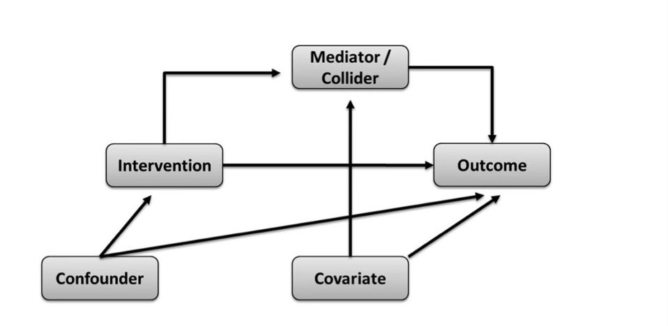
All the relevant variables in a DAG are written in individual boxes/circles, with various arrows pointing from one box/circle to another, together forming an interconnected web. Each arrow indicates a causal relationship between the variables. In addition, know that all variables in a DAG have a name. Of course, you have the exposure and the outcome variables that you're interested in studying. Then on top of that, you have variables named either colliders or non-colliders. A collider variable has only arrows going into it, none coming out of it. A non-collider variable has either arrows pointing out to variables before and after it (a ‘fork’, which may also be a confounder), or it has arrows pointing into it and away from it (a ‘mediator’). Try to familiarise yourself with these terms.
Once all relevant variables have been included, a completed DAG displays how the associations between the exposure and outcome of interest are transmitted through the various paths between them; otherwise said to be through the ‘open’ paths between them. At this stage, we are ready to identify the variables we need to statistically adjust for (or ‘condition on’) to remove confounding/distortion that forms part of the exposure-outcome relationship we’re interested in.
Specifically, we do this by identifying the 'backdoor paths'. A backdoor path is one that indirectly connects the exposure to the outcome of interest without being part of the mapped causal path, such that even if the exposure has no true effect on the outcome, the backdoor path would make it seem as though there is an effect. As put forth by the fantastic Judea Pearl, a thought leader in the causal inference space, if we statistically adjust for (or ‘condition on’) the set of variables that blocks all these backdoor paths (the 'backdoor path adjustment criterion'), we can effectively remove the influence of confounding and isolate the independent relationship between the exposure and the outcome. In fact, if you didn’t know, the technical definition of confounding bias is when there is a common cause of the exposure and outcome that has not been blocked by appropriate statistical techniques.
So, as long as our causal model is sound and we statistically adjust on the right variables, we achieve something similar to that of the randomisation process that I eluded to earlier: exchangeability. Conditional exchangeability, to be exact, wherein we can reasonably assume exchangeability between groups conditional on the fact that we have adjusted for all the right variables and have blocked all backdoor paths. Pretty cool (and nerdy), if you ask me.
Statistical Adjustment Methods and Stratification
Ok, so now let’s say we have identified our set of variables needed for adjustment in order to estimate a causal effect. The next step is to do the statistical adjustment. There are a couple of main ways to do this (at least that are common in nutrition research), so let’s start with the easiest way, stratification, before moving to the more complex way, multivariable adjustment.
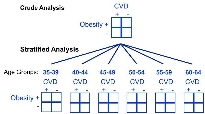
The use of stratification is based on the idea that even if participants in a study have diverse characteristics, there may at least be subsets of participants with comparable ‘potential outcomes’ that we can use to estimate causal effects. We can visualise what this is doing with a DAG, since stratification is essentially measuring the effect within subsets of participants where the arrows from the confounder(s) to the exposure do not exist. An example of stratifying by age (a common confounder) for the obesity and cardiovascular disease relationship is shown below. You can see here that instead of making comparisons within the whole population that may differ drastically by age, instead we can make comparisons within levels of the confounding variable(s), such as within specific narrow age ranges, such that it cannot confound the comparisons.
Or actually, let’s take an example more applicable to nutrition: let’s say smoking is a confounder for the effect of red meat on cardiovascular disease risk. In this case, we might then ask “what is the effect of red meat (<3 servings/week versus >3 servings/week) on cardiovascular disease when adjusted for smoking?”. To quantify this, we can make associations between 4 population strata; (1) high red meat eaters that smoke, (2) high red meat eaters that do not smoke, (3) low red meat eaters that smoke, and (4) low red meat eaters that do not smoke. Once we stratify the data into these levels of the confounding factor, it’s then possible to compute a weighted average across these population subsets. This allows us to quantify what is called the adjusted summary effect estimate, which in this case is the effect estimate once smoking has been adjusted for.
The Need for Multivariable Analysis
Although stratified analysis works best when 1 or 2 confounders require consideration, if there are a large number of potential confounders, it quickly becomes an unwieldy technique for eliminating confounding. As seen in the prior sections example, stratifying by just one variable already requires the analysis of those four groups, presented in a 2 x 2 table. So if we then introduce a second confounding variable that requires stratification—let’s say alcohol intake—now we have at least eight groups to analyse (2 x 2 x 2 = 8). Another third confounding variable—let’s say exercise—now we have at least 16 groups (2 × 2 × 2 × 2 = 16). Add a fourth—let’s say energy intake—now we have at least 32 groups (2 × 2 × 2 × 2 × 2 = 32); and this goes on and on until you have 100s if not 1000s of groups to analyse, which is clearly impractical and time-consuming. Plus, impracticality aside, increasing the number of variables by which to stratify can easily lead to a statistical issue, as reducing the amount of data per group risks estimating causal effects from data susceptible to high variance.
We therefore need another statistical tool, which is what leads us to the final topic: multivariable analysis. Because whereas stratification measures associations in subsets of the population under different conditions, regression analyses can estimate effects by modelling the same population under the same conditions (as in, modelling a counterfactual world or pseudoreality with equivalent conditions suitable for causal inference, that was not actually present in the real world).
Take the example below to get a better idea of this. It is a true analysis of smoking and the risk of death. In the bivariate analysis, which did not use multivariable analysis but only stratified by smoking status, we can see that persistent smokers appeared to have a lower risk of death compared with nonsmokers. Kind of strange. However, it turned out that the persistent smokers in this study were younger, had angina for a shorter time period, were less likely to have diabetes and hypertension, and had less severe coronary artery disease, all of which confounded the relationship between smoking and death. Stratification did not account for this. Therefore, multivariable analysis was necessary, allowing the researchers to model a pseudoreality in which the influence of confounding factors were removed, and nonsmokers and persistent smokers were actually characteristically similar other than the fact they did or did not smoke. And by doing the analysis in this way, suddenly the researchers found that persistent smokers indeed had a significantly greater risk of death than nonsmokers.
How Does Multivariable Analysis Work?
To end, I just want to clarify how multivariable analysis technically works, as I’m often asked this. So, another way to say multivariable analysis is multiple regression, with regression being the configuration of a mathematical model that measures the relationship between an independent (exposure) variable and a dependent (outcome) variable.
It’s easiest to understand regression by illustrating it on a graph, shown below. The vertical y-axis is termed the dependent (outcome) variable, while the horizontal X-axis is termed the independent (exposure) variable. If there’s one of each and the relationship is assumed to be linear, this is known as simple linear regression. The linear regression model is: Y = a + bX.
Y is the dependent (outcome) variable
X is the independent (exposure) variable.
a is the intercept or constant (the value of Y when X is 0)
b is the regression coefficient (the slope/gradient of the line)
The objective of linear regression is to find the line of best fit through the individual data points, such that the residuals (the distance of data points to the regression line) are minimised as much as possible. This is also known as the least-squares regression line. The strength and direction of the regression line are called the correlation coefficient, or R, which is quantified between -1 and 1. Exact measurements of -1 or 1 indicates that there is no error and no residuals, meaning that the individual data points all fit perfectly on the regression line; 1 being a perfectly positive correlation and -1 being a perfectly negative correlation. On the other end, 0 indicates that there is maximum error and residuals, meaning that a regression line is not compatible with the individual data points because they are so randomly scattered. Between these values, we have a number that represents a correlation with some degree of error.
If we then take the R-value and multiply it by itself, we obtain R-squared, a statistical measure that represents the proportion of the variance in the dependent (outcome) variable that’s explained by the variance in the independent (exposure) variable. So, if the R-squared of a model is 0.50, for example, then approximately 50% of variance in the outcome can be explained by variance in the exposure. However, R-squared only works as intended in a simple linear regression model with one exposure variable and one outcome variable, with no confounders to adjust for. When we need to account for several confounders, though, which is almost always the case, the R-squared must be adjusted.
This need for more complex adjustments is why we typically rely on multiple linear regression. Contrary to how it sounds, though, multiple linear regression it is not just a series of simple linear regressions. Rather, it combines multiple independent variables (the exposure and the confounders) that affect an outcome into a single generic equation/model. The generic algebraic model used for multivariable analyses is: Y = b0 + b1X1 + b2X2 + b3X3…
Y is the dependent (outcome) variable
X1, X2, X3, and so on are the independent (exposure and confounder) variables
b0 is the intercept or constant
b1, b2, b3, and so on are the individual regression coefficients showing the impact of each exposure/confounder on the outcome
In my opinion, though, a great way conceptualise multiple regression is with a 3D graph rather than a standard 2D graph used for simple regression. Because, when we are adding other independent (confounder) variables to our mathematical model, we are essentially as adding another dimension to a standard 2D graph. And when moving from 2 dimensions to 3 dimensions, things change; if we have 2 dimensions, then we have a line, whereas if we have 3 dimensions, then we have a plane (i.e. a flat surface). This means that the regression line (the least-squares line) is more now of a regression plane; however, the same concept applies whereby the regression itself is again minimising the residuals on this 3D plane. Therefore, it is still possible to tranform what is a relatively complicated pattern of 3D data back into a 2D regression line that can be used to visualise the exposure-outcome relationship when adjusted for the confounders.
Plus, for those of you wondering what on earth this model is actually doing conceptually, well, the best way to think of it is still complicated, but it’s conceptually similar (not exactly) to regressing the outcome variable on the confounder variable(s) and then taking the residuals of that model to regress on the exposure variable we’re interested in. This is often termed as “holding the confounders constant” while quantifying how much of the variance in the outcome is explained by variation in the exposure. If it so happens that the effects of confounder(s) explain away the association between exposure and outcome, then a causal relationship is unlikely. But if there still appears to be a significant association between the exposure and outcome after accounting for the confounder effects, then a causal relationship is plausible. For this reason, the statistical adjustment is tied with our thinking about causal inference in the absence of randomising participants or intervening in some way.
So, I hope this article was helpful. Please feel free to ask any questions and state your own opinion in the comments below or via email. We’re all learning, so any additional information or viewpoints are welcome.







So, stratification does not need other data, but the multivariate adjustment model uses external data. What external data is used? I mean, does it have to be an RCT meta-analysis with a dose-response curve, or can it be non-randomized/without a dose-response curve?